Matplotlib: Scatter Plot
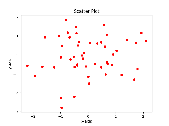
A scatter plot (or scatter graph) is a two-dimensional graph where each data is plotted as a dot representing the values for two set of quantitative variables, one along the $x$-axis and the other along the $y$-axis.
Here in this tutorial, we will make use of Matplotlib's scatter() function to generate scatter plot.
We import NumPy to make use of its randn() function, which returns samples from the standard normal distribution (mean of 0, standard deviation of 1).
Inside the scatter() function, s is the size of point in scatter plot.
					from matplotlib import pyplot as plt
					import numpy as np
					x = np.random.randn(50)
					y = np.random.randn(50)
					plt.scatter(x, y, color='r', s=30)
					plt.xlabel('x-axis')
					plt.ylabel('y-axis')
					plt.title('Scatter Plot')
					plt.show()

Different Sizes and Different Colours
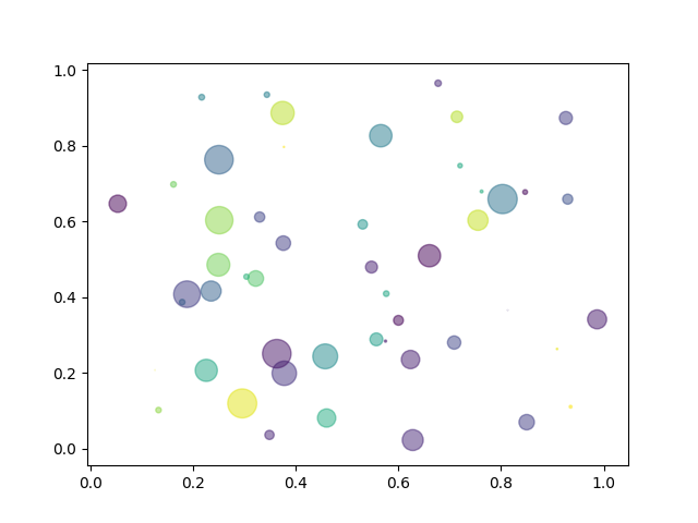
Now dots can be of varied sizes and colours. We will generate them in the example below. Instead of randn() (which we used above), we use the rand() function here which returns random values from a uniform distribution over [0,1). The s parameter passed to the scatter() function is the size of the marker (dots here) in points$^{2}$.
						from matplotlib import pyplot as plt
						import numpy as np
						n=50
						x = np.random.rand(n)
						y = np.random.rand(n)
						colors = np.random.rand(n)
						size =pow(20 * np.random.rand(n),2)
						plt.scatter(x, y, s=size, c=colors, alpha=0.5)
						plt.show()
