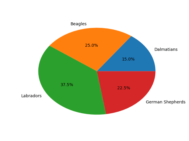
Matplotlib: Pie Chart
A pie chart is a type of graph in which a circle is partitioned into sectors (also called wedges or slices) occupying relative area of data.
In this tutorial, we will plot a pie chart using Matplotlib.
The below Matplotlib program plots a basic pie chart with the pie() function. The autopct parameter is where the wedges are labelled with string or numeric value. The value %.1f%% is the Python number format .1f% (which includes the percentage symbol %), rounding off the number to one decimal place. The format %.2f%% will round off the values into two decimal places.
					import matplotlib.pyplot as plt
					labels = 'Dalmatians', 'Beagles', 'Labradors', 'German Shepherds'
					sizes = [6, 10, 15, 9]
					fig, ax = plt.subplots()
					ax.pie(sizes, labels=labels, autopct='%.1f%%')
					plt.show()
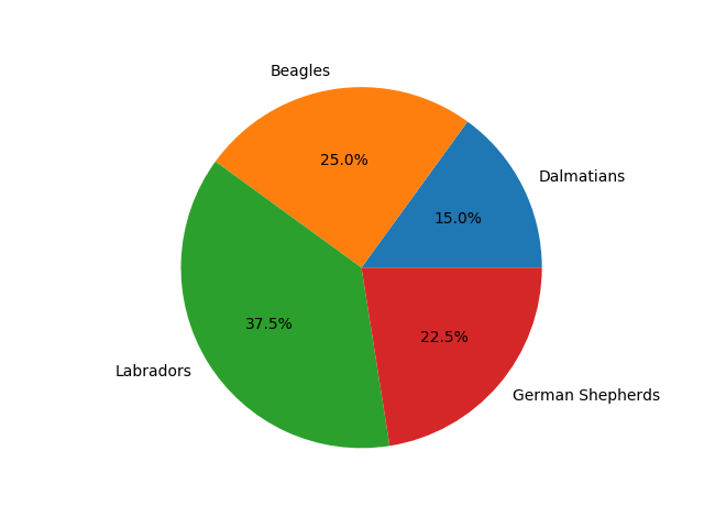
Equal Axes
To above chart is oval-shaped. To fix the shape into a perfect circle, we need to keep the figure and axes aspect equal. The set_aspect() method sets the desired aspect.
					import matplotlib.pyplot as plt
					labels = 'Dalmatians', 'Beagles', 'Labradors', 'German Shepherds'
					sizes = [6, 10, 15, 9]
					fig, ax = plt.subplots()
					ax.pie(sizes, labels=labels, autopct='%.1f%%')
					ax.set_aspect('equal')
					plt.show()
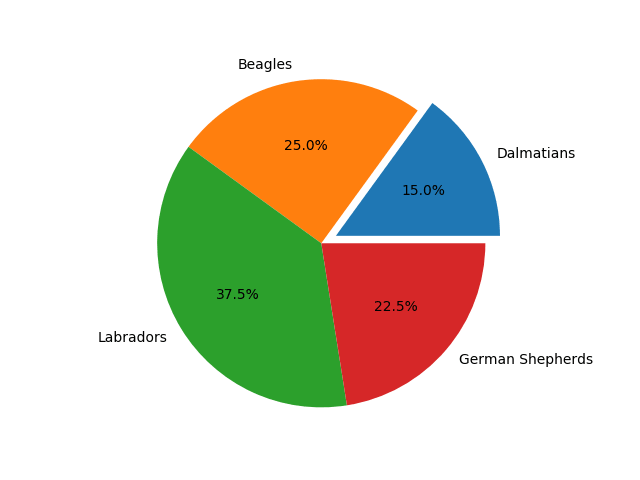
Explode/Expand Slices
The explode parameter lets you explode/expand a wedge/slice. Below we expand the first slice by 0.1 fraction of the radius of the pie.
					import matplotlib.pyplot as plt
					labels = 'Dalmatians', 'Beagles', 'Labradors', 'German Shepherds'
					sizes = [6, 10, 15, 9]
					explode = (0.1, 0, 0, 0)
					fig, ax = plt.subplots()
					ax.pie(sizes, labels=labels, autopct='%.1f%%')
					ax.set_aspect('equal')
					plt.show()
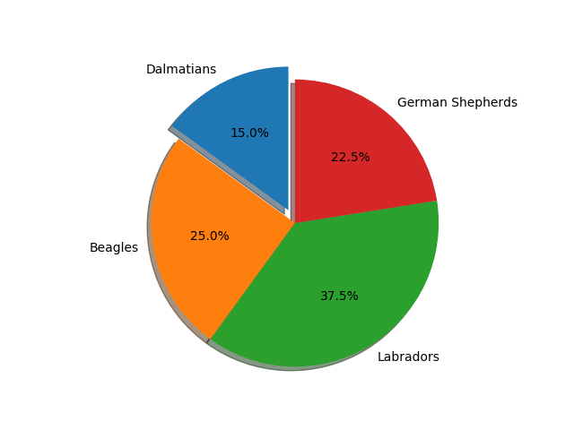
Start Angle and Shadow
The shadow parameter draws a shadow beneath the pie slices. Also, by default, the first slice starts at the computed angle from the +ve x-axis in the counterclockwise direction. We can alter this starting angle using the startangle parameter. Below we assign the value 90 to make it start from the +ve y-axis.
					import matplotlib.pyplot as plt
					labels = 'Dalmatians', 'Beagles', 'Labradors', 'German Shepherds'
					sizes = [6, 10, 15, 9]
					explode = (0.1, 0, 0, 0)
					fig, ax = plt.subplots()
					ax.pie(sizes, labels=labels, autopct='%.1f%%', shadow=True, startangle=90)
					ax.set_aspect('equal')
					plt.show()
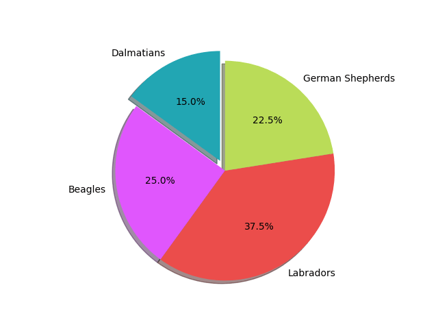
Custom Colours
By default, the pie slices will pick the colours in the 10-palette default property cycle. So the first slice Dalmatians is coloured with (#1f77b4 ), Beagles with (#ff7f0e ), Labradors with (#2ca02c ) and German Shepherds with (#d62728 ).
For applying custom colours, there is the colors parameter where we can give preferred colours in array-like sequence.
					import matplotlib.pyplot as plt
					labels = 'Dalmatians', 'Beagles', 'Labradors', 'German Shepherds'
					sizes = [6, 10, 15, 9]
					explode = (0.1, 0, 0, 0)
					colors = ('#22a6b3', '#e056fd', '#eb4d4b', '#badc58')
					fig, ax = plt.subplots()
					ax.pie(sizes, labels=labels, autopct='%.1f%%', shadow=True,
						startangle=90, colors=colors)
					ax.set_aspect('equal')
					plt.show()
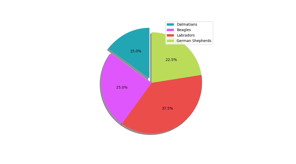
Legend
Similar to other plots, we can place a legend on our graph using the legend() function. Now we can do away with the labels parameter.
					import matplotlib.pyplot as plt
					labels = 'Dalmatians', 'Beagles', 'Labradors', 'German Shepherds'
					sizes = [6, 10, 15, 9]
					explode = (0.1, 0, 0, 0)
					fig, ax = plt.subplots()
					ax.pie(sizes, autopct='%.1f%%', shadow=True, startangle=90)
					ax.legend(labels, loc='upper right')
					ax.set_aspect('equal')
					plt.show()